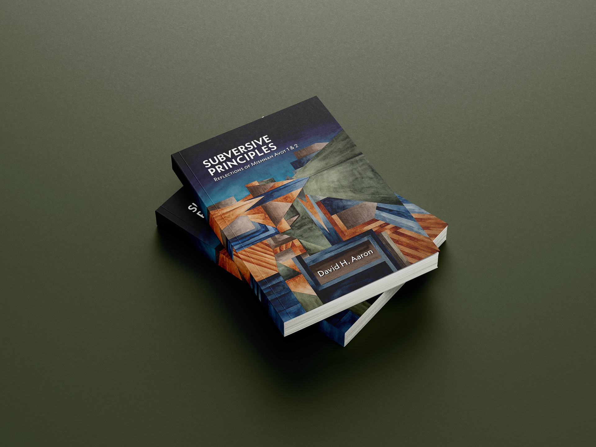

Subversive Principles
Reflections of Mishnah Avot 1 & 2
by David H. Aaron
CLIENT David H. Aaron for Pickwick Publications, 2024
Design of the book cover, including watercolour and gouache painting, typesetting of the entire book (6x9 inches, 558 pages)
BRIEF: Early in the process, David and I discussed the content of the book, which provides an in-depth view on and analysis of the Mishnah Avot chapters 1 and 2, exploring their many layers and aspects with nuanced consideration. Our early collaboration gave me ample time to develop a suitable cover design. To my fortune I was given a lot of creative freedom for the cover which gave me the opportunity to explore.
ABOUT THIS BOOK: Avot, a tractate in the Mishnah (c. 220 CE), is the single most studied and commented upon Jewish text outside the Hebrew Bible. [...] Subversive Principles furthers the argument that Avot was composed to facilitate the formation of such a fellowship by engaging the analytical insights of Pierre Bourdieu regarding symbolic language and other theorists elucidating the role of exchange theory in religions. This volume explores an ethics of reading and the matter of historical relativism as such concerns influence the historical-critical interpretation of a canonical text. (Text source: Amazon)
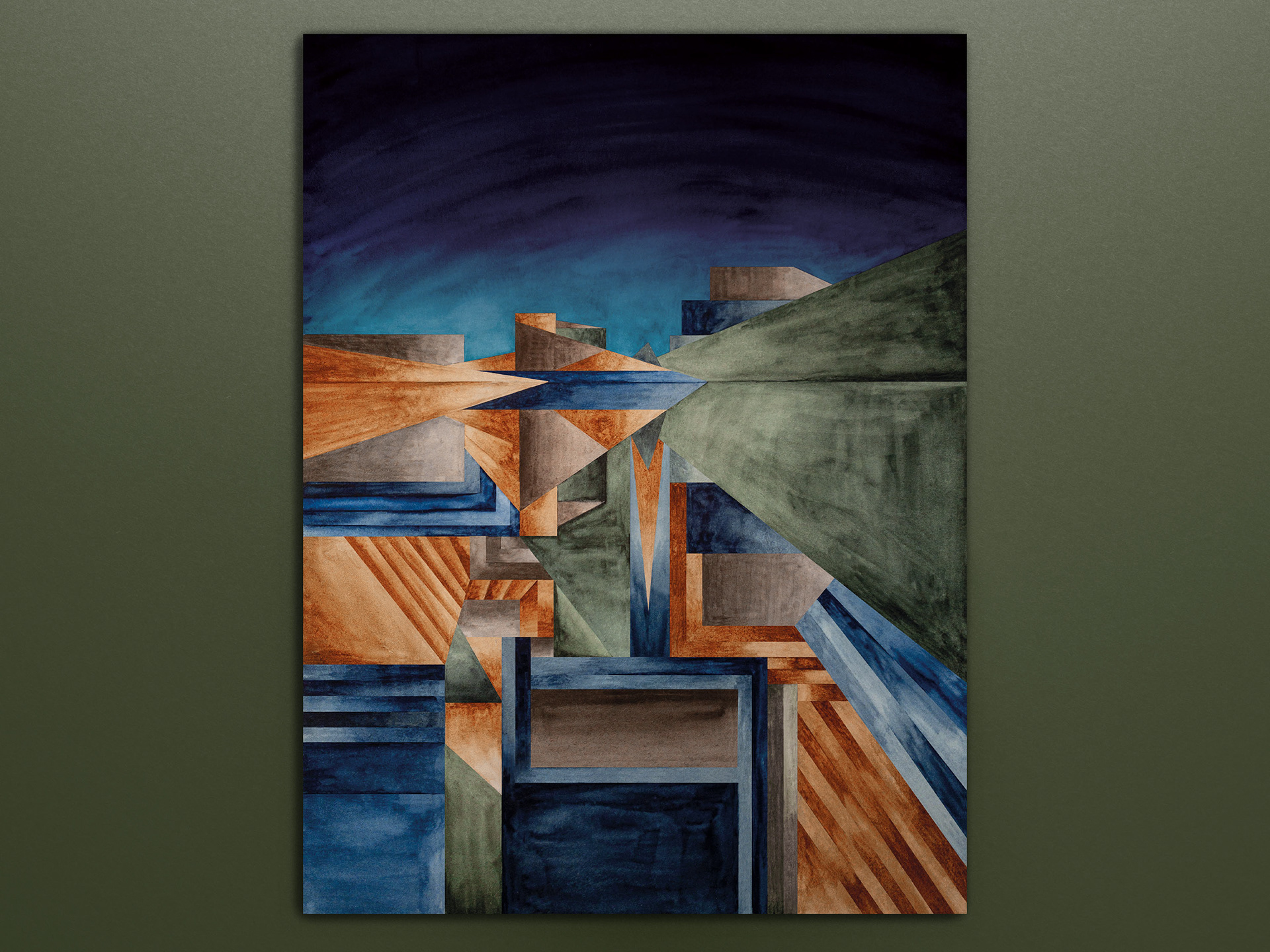
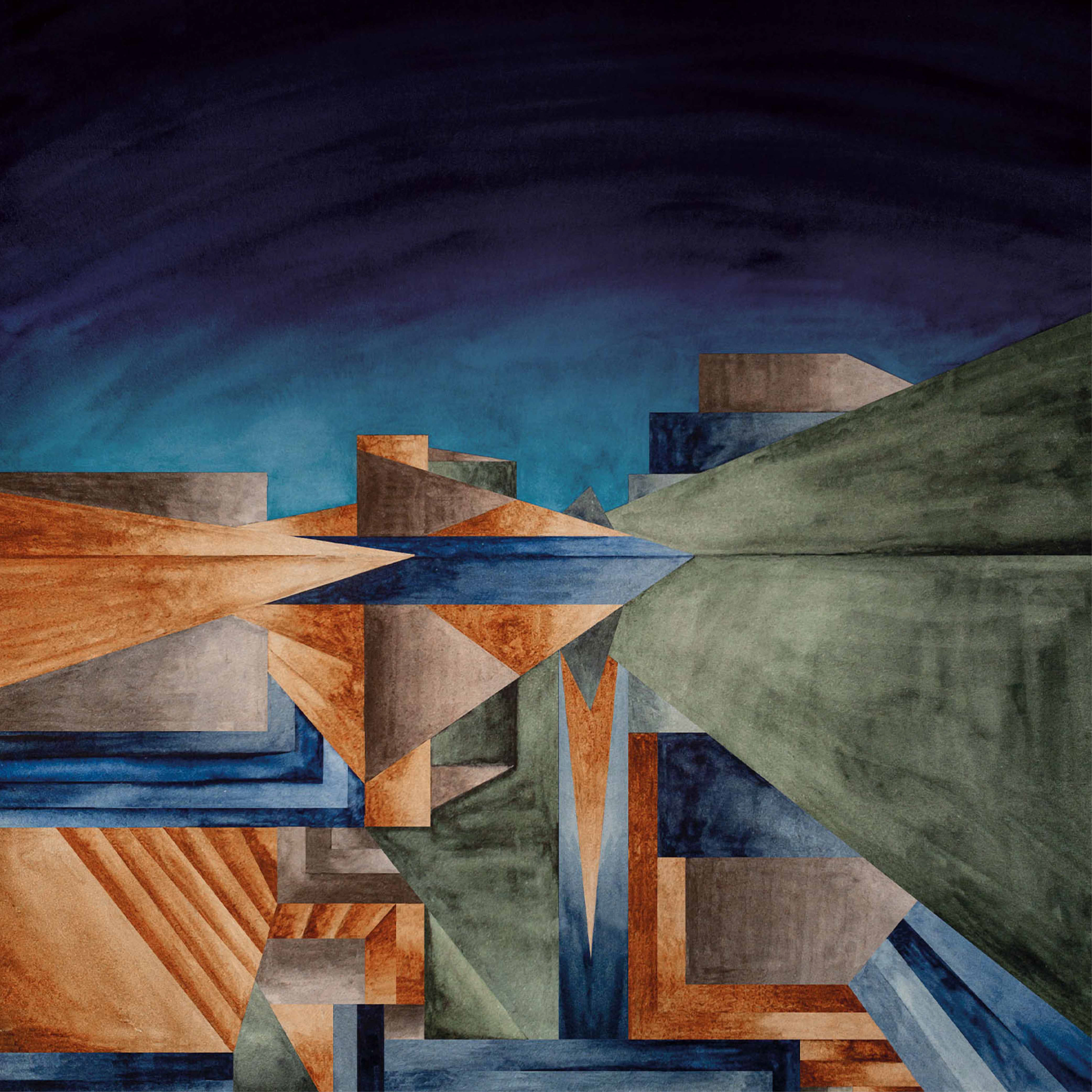
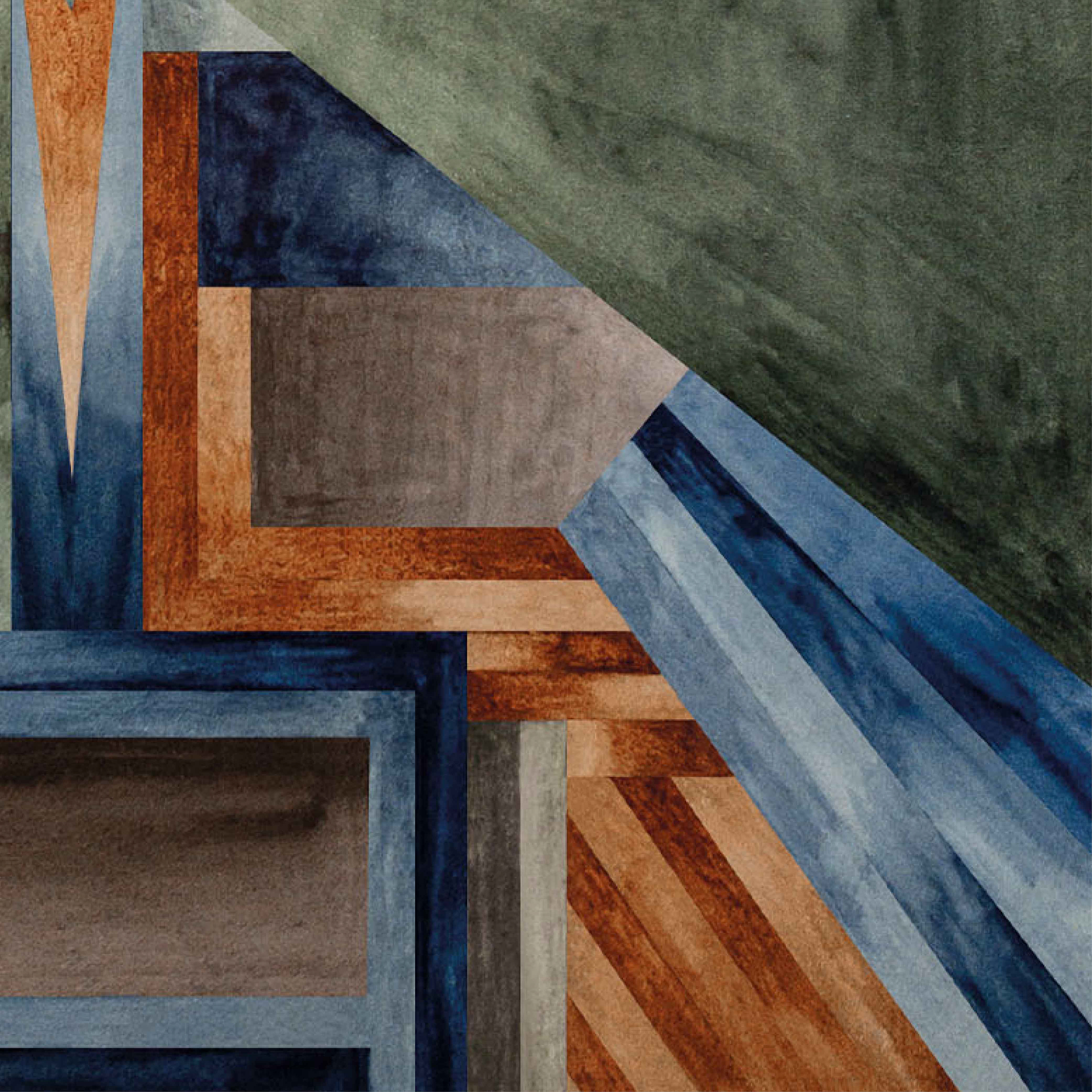
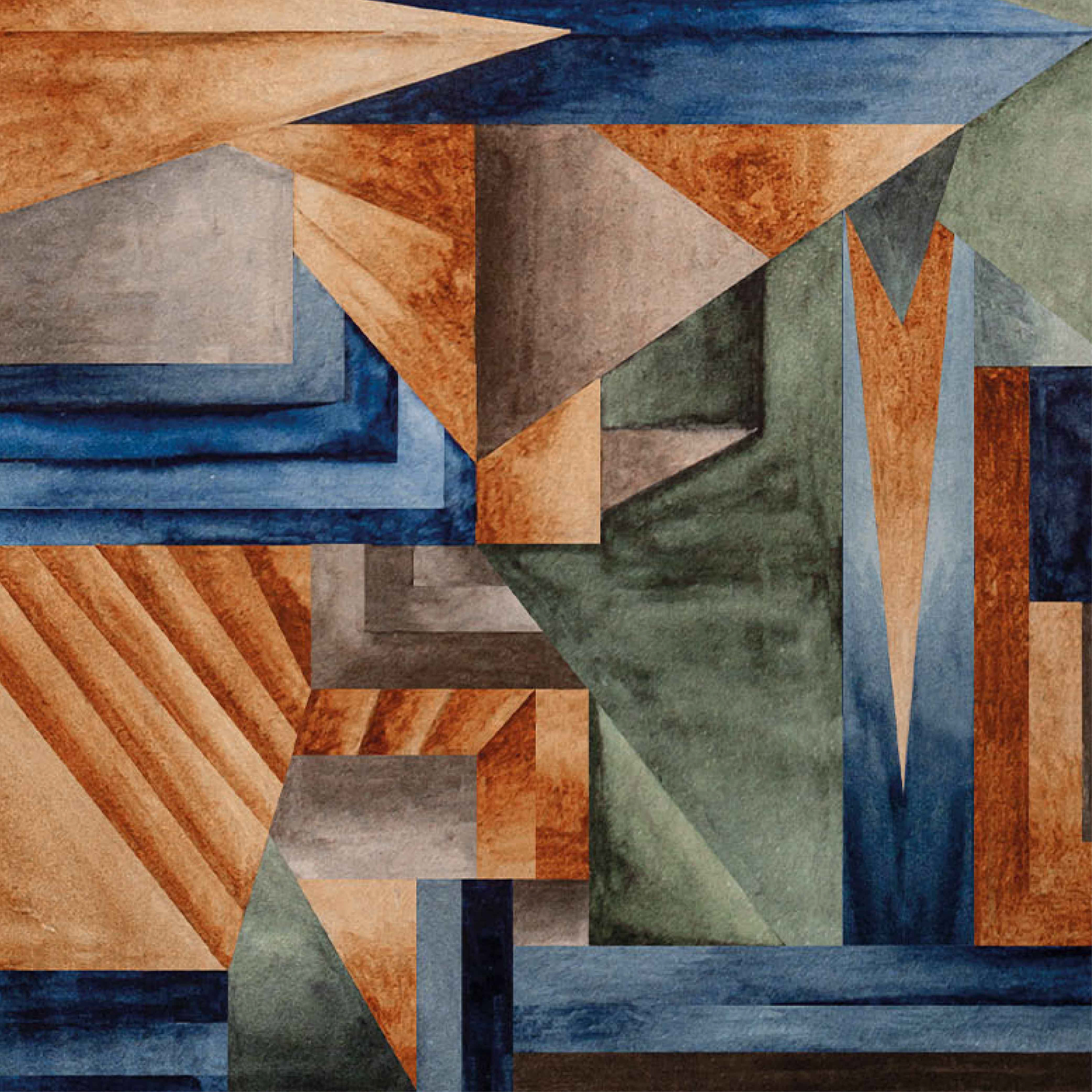
ABOUT THE COVER IMAGE: After careful consideration and experimentation, I chose an approach (cubism) that I feel resonates the most with parts of the book's essence: an in-depth, deeply contemplative, yet subtly subversive exploration of a traditional text.
Drawing inspiration from cubism, which captures the book's multi-layered analysis, I created a landscape scene mirrored in water. The reflection appears 1.5 times longer than its terrestrial counterpart, suggesting the depth of reflection on the subject. To represent the text's multiple perspectives, I rotated portions of the reflection 90 degrees, weaving them into a cohesive composition.
The colour palette features muted tones, echoing the author's nuanced approach to the subject matter. For practical reasons, I deliberately incorporated space for the author's name, ensuring the design remains balanced and purposeful.
You can read an excerpt here: GOOGLE BOOKS LINK
Materials used: Watercolour, gouache, watercolour paper, Photoshop, Indesign

